client: Amacore Group
Role: Brand Identity
Case Study:
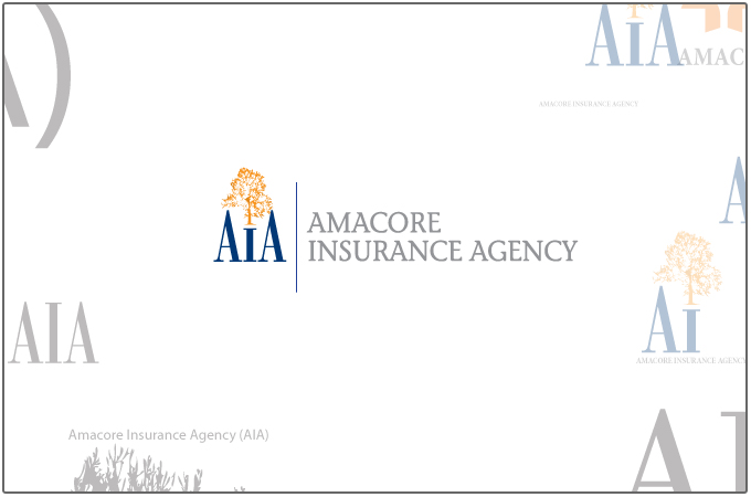
I was asked to design a brand mark for a new division of Amacore Group called amacore Insurance Agency. This subsidiary would primarily work with various insurance types and not only be committed to health care.
The goal was to create a logo that symbolized strength and piece of mind. Insurance, after all, is about security and purpose. This logo would have to integrate well with the current brand values of Amacore itself keeping true to certain characteristics. With this in mind the typography differs but still utilizes basic elements like Serif Fonts and distinguished letter-styles. I toyed with the idea of including a tree playing into the strength of a tree as well as the potential it has to grow in many directions.