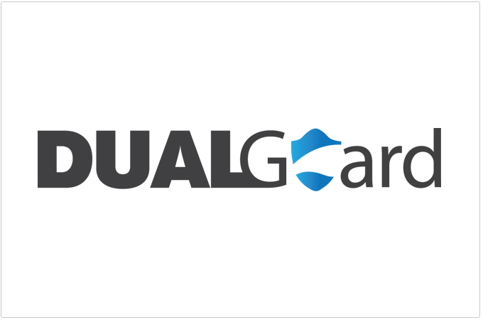
client: Dual Guard
Role: Brand Identity
Case Study:
This logo was for an insurance company that gave dual insurance both for life and insurance that dealt with keeping your identity safe.
The idea was very simple. The client wanted the logo to look safe and strong. I chose to go with sans serif fonts and attempted to keep the boldness and emphasis on the word dual as this was what I felt set the clients product apart from it's competitors. I also added a partial silhouette of a shield akin to the pepsi logo being a creative part of a circle.